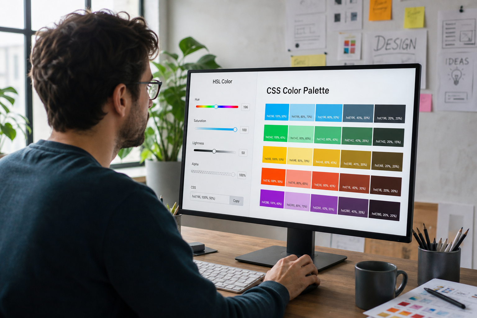
Use HSL to build predictable CSS gradients, dark modes, and design tokens. Convert HEX and RGB with practical examples.
Why HSL Fits Human Theme Design Better Than Raw Hex
Hex notation encodes red, green, and blue channel bytes compactly, but small edits do not correspond to intuitive changes in lightness or saturation. HSL—hue, saturation, and lightness—maps more closely to how designers talk about color: shift hue to recolor a brand, lower lightness for text contrast, or reduce saturation for muted backgrounds. CSS Color Module specifications from the W3C define hsl() and hsla() functions widely supported in modern browsers. When building design tokens, HSL makes systematic scales easier than guessing new hex values for every state.
The Color Converter on ToolsFree.org converts among hex, RGB, and related representations so you can experiment and then export whatever your codebase expects. Start in HSL for palette logic, then convert to hex for legacy tools that still require six-digit strings. Document both forms in your design system to avoid drift between Figma exports and CSS variables. Consistent conversion prevents “almost the same” blues from accumulating across components over successive releases.
Motion design pairs well with HSL when you animate lightness for gentle attention cues instead of flashing saturated hues that feel alarming. Keep animated gradients subtle and respect prefers-reduced-motion. Document which tokens may animate and which must remain static for readability of text. A restrained motion language rooted in the same hue family feels intentional rather than decorative noise competing with your primary call to action on marketing pages.
Anatomy of hsl() and Modern CSS Color Syntax
Classic CSS syntax looks like hsl(210, 60%, 40%) with comma separators, while newer CSS Color Level 4 syntax allows space-separated values with an optional slash for alpha: hsl(210 60% 40% / 0.9). Hue is an angle on the color wheel, typically written in degrees from 0 to 360. Saturation and lightness are percentages. Lightness 0% is black and 100% is white regardless of hue, which is powerful for generating neutral overlays and disabled states from the same brand hue family.
Alpha transparency belongs in hsla() or the slash syntax rather than inventing separate tokens for every opacity. Prefer adjusting alpha for overlays instead of picking unrelated gray hexes that fight dark mode. When mixing with hex in the same stylesheet, convert carefully so perceived brightness stays aligned. Validate contrast after conversions because HSL lightness is not identical to perceptual lightness models like OKLCH, yet it remains a pragmatic choice for many product teams.
:root {
  --brand-h: 210;
  --brand-s: 70%;
  --brand-l: 45%;
  --brand: hsl(var(--brand-h) var(--brand-s) var(--brand-l));
  --brand-soft: hsl(var(--brand-h) 50% 92%);
}
Building Gradient Stops From a Single Hue Family
CSS linear and radial gradients become cohesive when stops share a hue and vary primarily in lightness or saturation. A hero background might move from hsl(210 70% 35%) to hsl(210 60% 55%) without introducing a second unrelated hue that feels accidental. For energetic marketing sections, small hue shifts of ten to twenty degrees can add depth while remaining on-brand. Keep midpoints intentional; browsers interpolate in a working color space that may surprise you if stops are extremely far apart.
Use the Color Converter to pick endpoint colors, convert to HSL, then align hues before pasting into CSS. Test gradients on both light and dark themes because a stop that looks subtle on white can become muddy on charcoal. Prefer three stops over seven unless you are illustrating data; extra stops often add noise without hierarchy. Pair gradients with sufficient text contrast, remembering WCAG contrast guidance for foreground content placed above colorful backgrounds.
Theme Tokens: Hover, Active, and Muted Variants
Derive interactive states by adjusting lightness and saturation rather than hand-picking disconnected hex codes. Darken lightness slightly for hover on light themes, or lighten it on dark themes, while keeping hue constant. Muted text can reduce saturation and nudge lightness toward the background. Disabled states often decrease saturation and contrast together so components look inert without relying solely on opacity that harms readability of icons.
Store hue once in a CSS variable and compose multiple tokens from it, as shown in design-system practice across many product companies. This approach makes rebranding a matter of changing a few hue values instead of rewriting dozens of hex literals. Convert final tokens back to hex only when a third-party charting library demands it. Keep a conversion checklist linked from All Tools so engineers and designers share the same reference during reviews.
- Keep hue stable across interactive state variants
- Adjust lightness for hover and active feedback
- Reduce saturation for muted and disabled styles
- Recheck WCAG contrast after every token change
Gradients, Brand Atmosphere, and Performance Notes
Large full-bleed CSS gradients are cheaper than heavy image backgrounds for many landing pages, but complex repeating gradients can still cost paint time on low-end devices. Prefer simple linear gradients for atmosphere and reserve images for real product photography when needed. Avoid stacking numerous translucent gradient layers that force expensive blending on scroll. Measure with browser performance tools if animated gradients enter the experience.
Brand atmosphere benefits from restrained palettes: one dominant hue family, one accent, and neutral supports. HSL makes that restraint easier because you see relationships numerically. When exporting assets for email clients with weaker CSS support, bake gradients into images selectively and keep solid HSL-derived hex fallbacks for buttons. The Color Converter helps produce those fallback hex values quickly during campaign production.
Accessibility: Contrast, Color Blindness, and Focus States
WCAG contrast requirements care about relative luminance between text and background, not about how elegant your HSL scale looks on a poster. After building a gradient, place sample text and measure contrast for primary and secondary sizes. Do not convey meaning by hue alone; pair color with icons or text for users with color-vision deficiencies. Focus rings should maintain contrast against both ends of a gradient behind interactive controls.
Dark mode tokens are not merely inverted lightness. Saturation often needs reduction at high lightness to avoid neon vibes that tire the eyes. Test in real ambient lighting conditions when possible. Document minimum contrast pairs in your design system and reject pull requests that introduce low-contrast gray-on-gray text even if the gradient demo looks striking in a dark IDE theme screenshot.
Interop With Hex, RGB, and Design Tools
Most design tools historically centered on hex and RGB, so handoff still involves conversion. Establish a single source of truth—often HSL variables in CSS—and generate hex aliases for tools that cannot consume hsl() directly. Be aware that rounding channels during conversion can accumulate visible drift across a large token set. Periodically audit that brand primary in CSS still matches the marketing site favicon and app icon.
When collaborating asynchronously, paste values through the Color Converter rather than describing “a bit darker blue” in chat. Pair color discussions with screenshots and token names. If you also encode colors in URLs for preview links, ensure hex digits remain intact with proper encoding via the URL Encoder. Clear numeric communication prevents bike-shedding and keeps pull requests focused on product behavior.
A Practical Workflow for CSS Gradients on ToolsFree
Pick a brand hue, generate light and dark stops in HSL, convert to hex if needed, then assemble a linear-gradient in your stylesheet. Verify text contrast and hover states before merging. Keep tokens named by role—background, accent, danger—rather than by raw color words that go stale after a rebrand. Use ToolsFree.org utilities during experimentation so conversions stay local and fast.
Explore related developer helpers on All Tools when your theme pipeline also touches JSON design tokens or hashed cache busting for stylesheets. HSL will not replace every modern color space, but it remains one of the most practical bridges between human palette thinking and production CSS. Mastering hue-stable scales pays dividends every time you add a new component state or marketing gradient.
- Design in HSL, export hex only when required
- Build gradients from shared hue families
- Derive states by lightness and saturation shifts
- Validate contrast before shipping theme changes
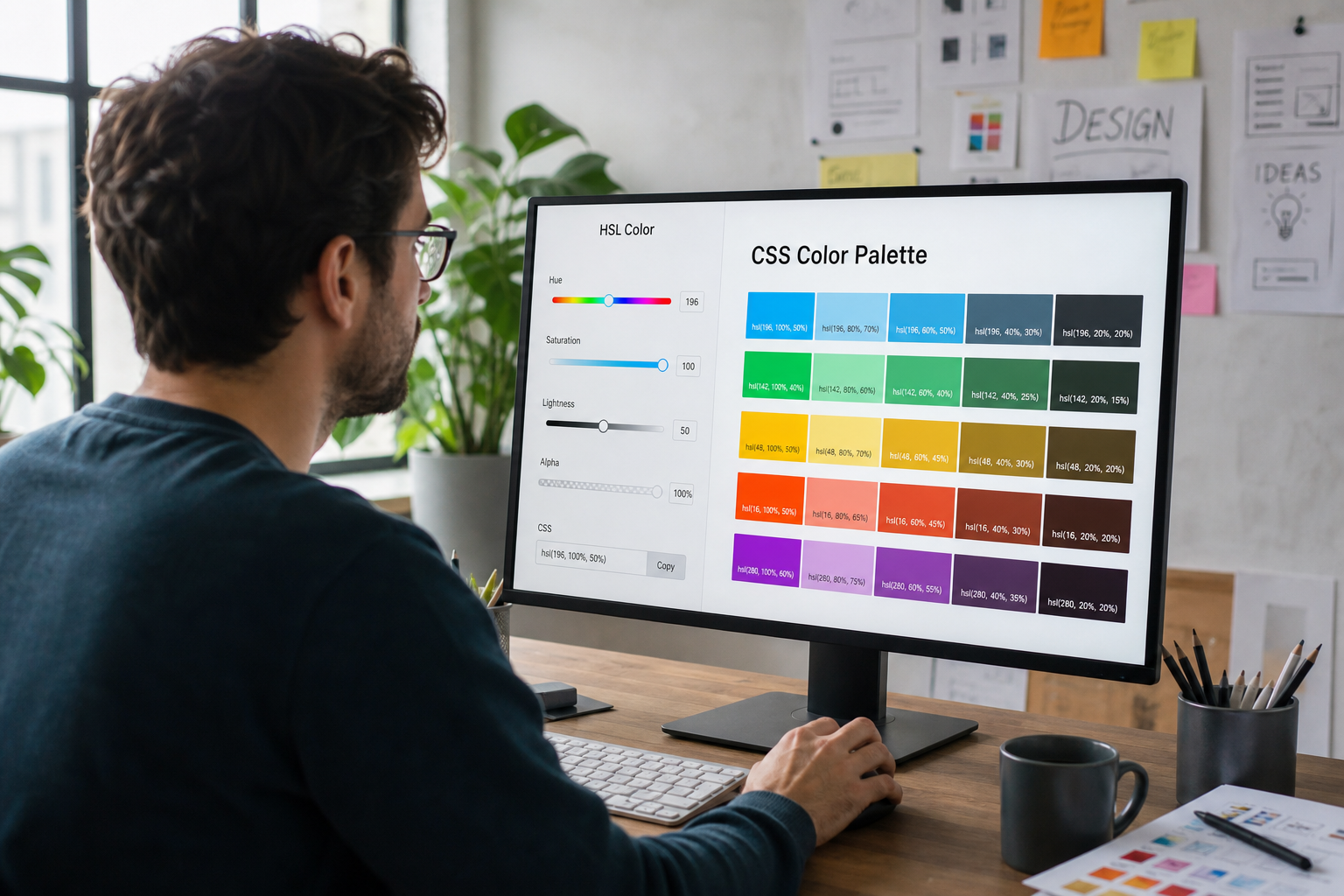
Convert HSL, hex, and RGB values while building your next palette. Color Converter →